We design libre / open source fonts. Learn more and contribute to the adventure of Velvetyne by reading our “about” page.
Typefesse
all curves are bouncy
all curves are bouncy
Designed by
Styles
- typefesse claire obscure
- typefesse pleine
Collections
Writing systems
Date
Published on October 29, 2019
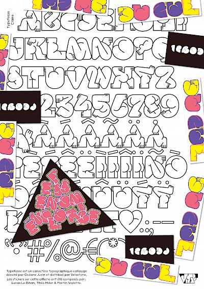
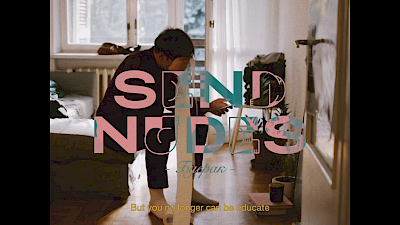
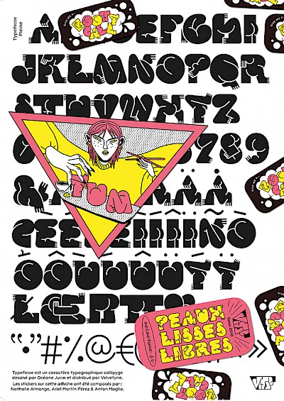
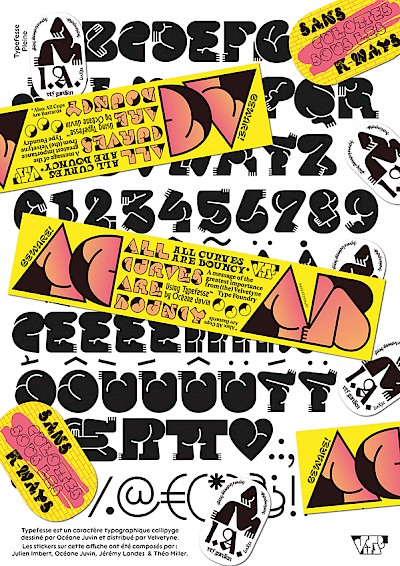
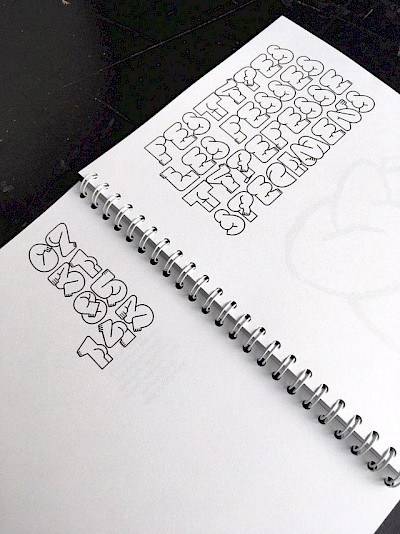
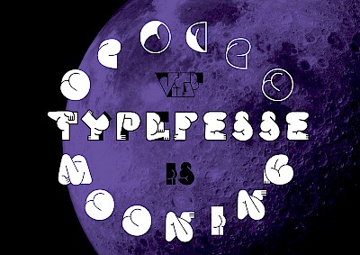
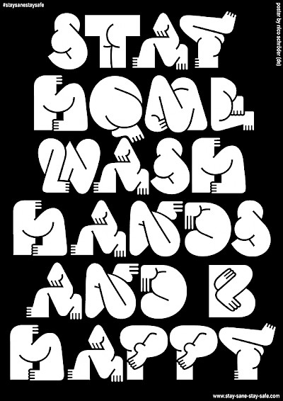
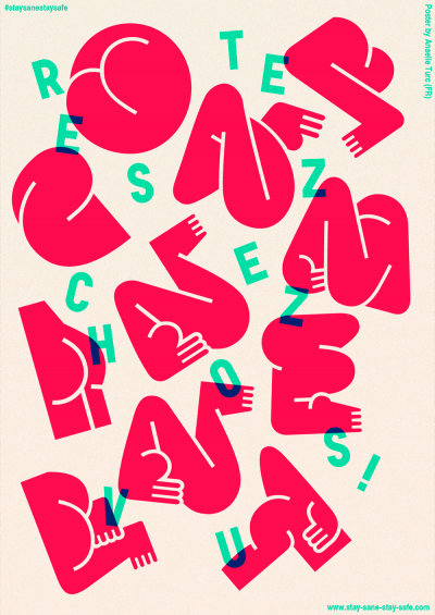
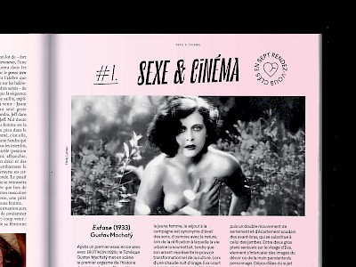
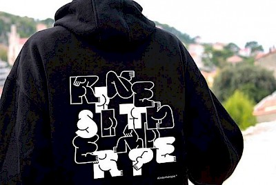
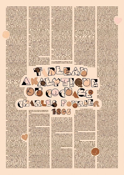
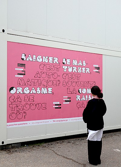
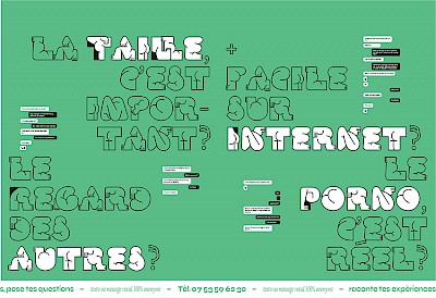
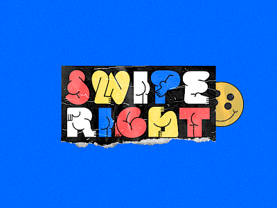
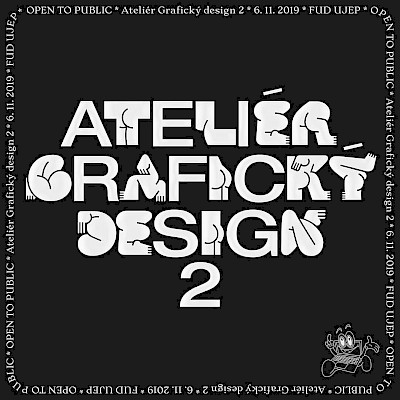
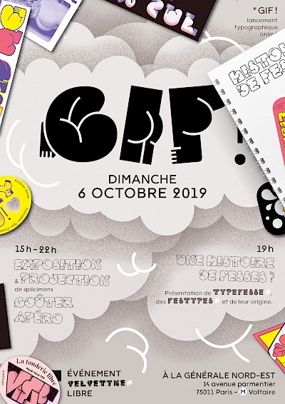
Typefesse is a playful butt-shaped typeface in which the letters are rendered in such a way that the reading is done through the folds of the body.
The design of Typefesse is motivated by the surprising combination of two vocabularies, that of the body and that of the alphabet. The drawn alphabet reveals contortionist and playful creatures that either hide inside of it or that expose themselves to it. Is it the letter that defines the bodies' shapes, or is it the other way around? These creatures play with the viewer's gaze and fight against the lettershapes by disturbing their readability with their exuberance. The alphabet is laid bare and readers become spectator-voyeurs in spite of themselves. Typefesse is a typeface that generates a confusion between reading, seeing and spying. It's a titling font, although it has a surprising readability at small body sizes. Its three styles have been named in reference to the moon and its mysteries :
Claire — This is the most agile style, and the most contorted. The bodies are forced to twist or curl up in order to fit inside the letters. When they're set together to form a word, they seem to snuggle against each other and they make the adjacency of alphabetic signs more intimate.
Pleine — This style designates the heart of the letters. It allows the greatest readability at small body sizes and can be used as an additional layer on top of the Claire and Obscure styles.
Obscure — This is the most graphical style and the most illustration-like. The alphabet is represented as an assortment of lock holess through which the reader discovers the backside of letters. The letters are treated like spaces of play.
They are ordered in 2 font-files: Typefesse Claire-Obscure where capitals are Obscure whereas lower cases are Claire and Typefesse Pleine where outlines have been removed.
Typefesse got featured in Typographica's favourite typefaces of 2019. Read the article.
