We design libre / open source fonts. Learn more and contribute to the adventure of Velvetyne by reading our “about” page.
Pilowlava
Anton Moglia and Jérémy Landes create an organic bespoke typeface
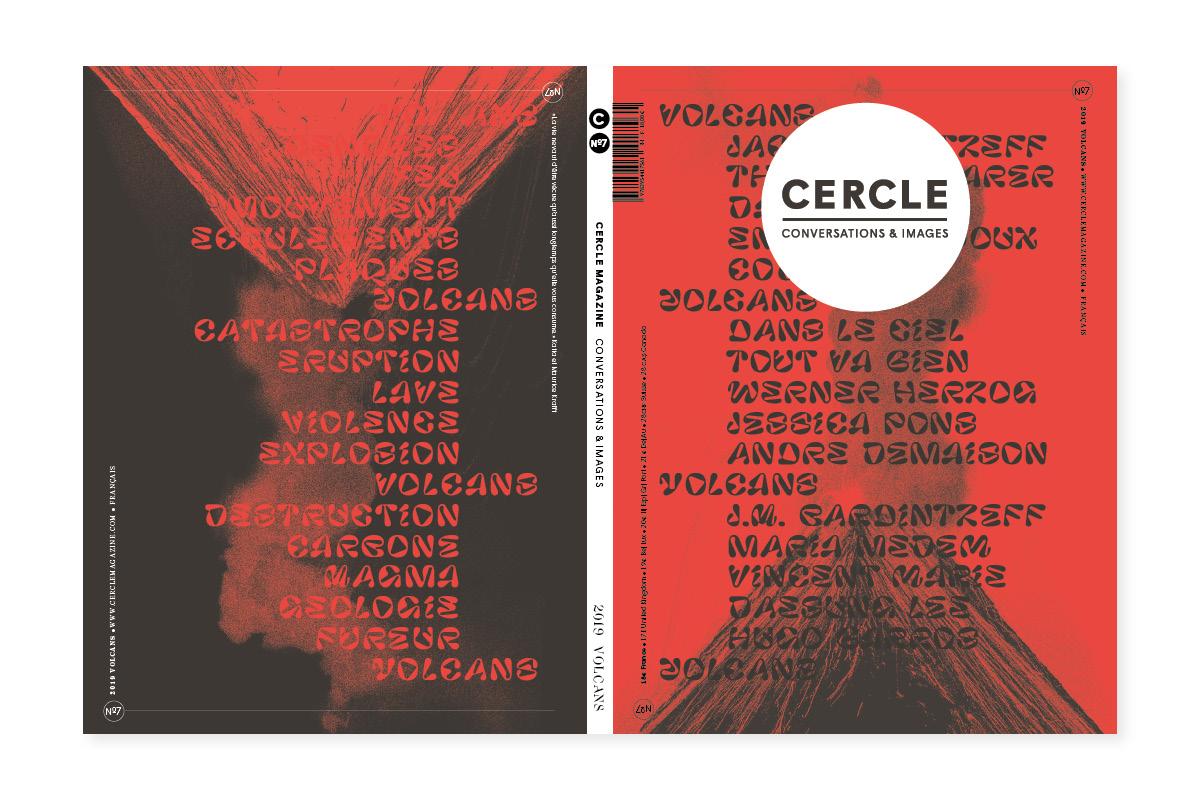
for the last issue of Cercle Magazine
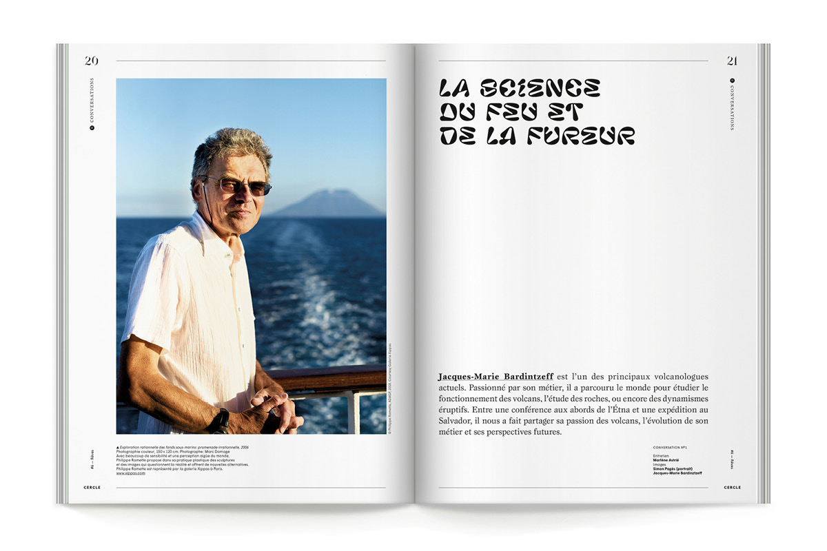
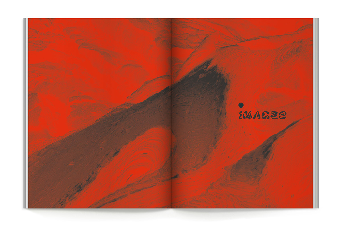
We were commissioned by Cercle Magazine to design a titling typeface for their last issue dedicated to the burning issue of Volcanos. Cercle has an history with bespoke typefaces as they ask a different designer(s) to create a new font for each of their annual issues. Together with them, we decided that this would be a libre font (surprise!!!) and that we would release it on Velvetyne the same day the magazine was published. This day was the 26th of April 2019.
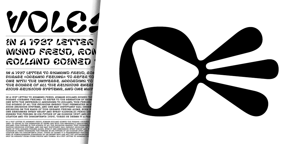
Pilowlava is born from intense exhanges between Anton and Jérémy, each of them modifying the first sketches of the other. Anton started with a very curvy and dynamic script typeface that Jérémy calmed down with some tense curves and geometric outlines: strait lines, almost circular curves…
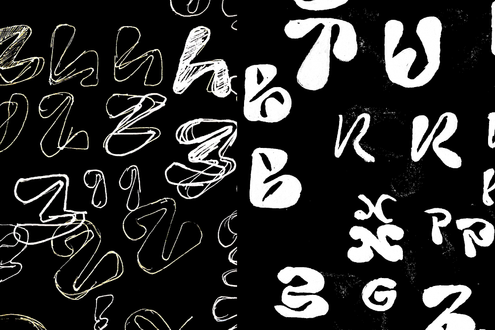
Sketches from Anton (left) and Jérémy (right)

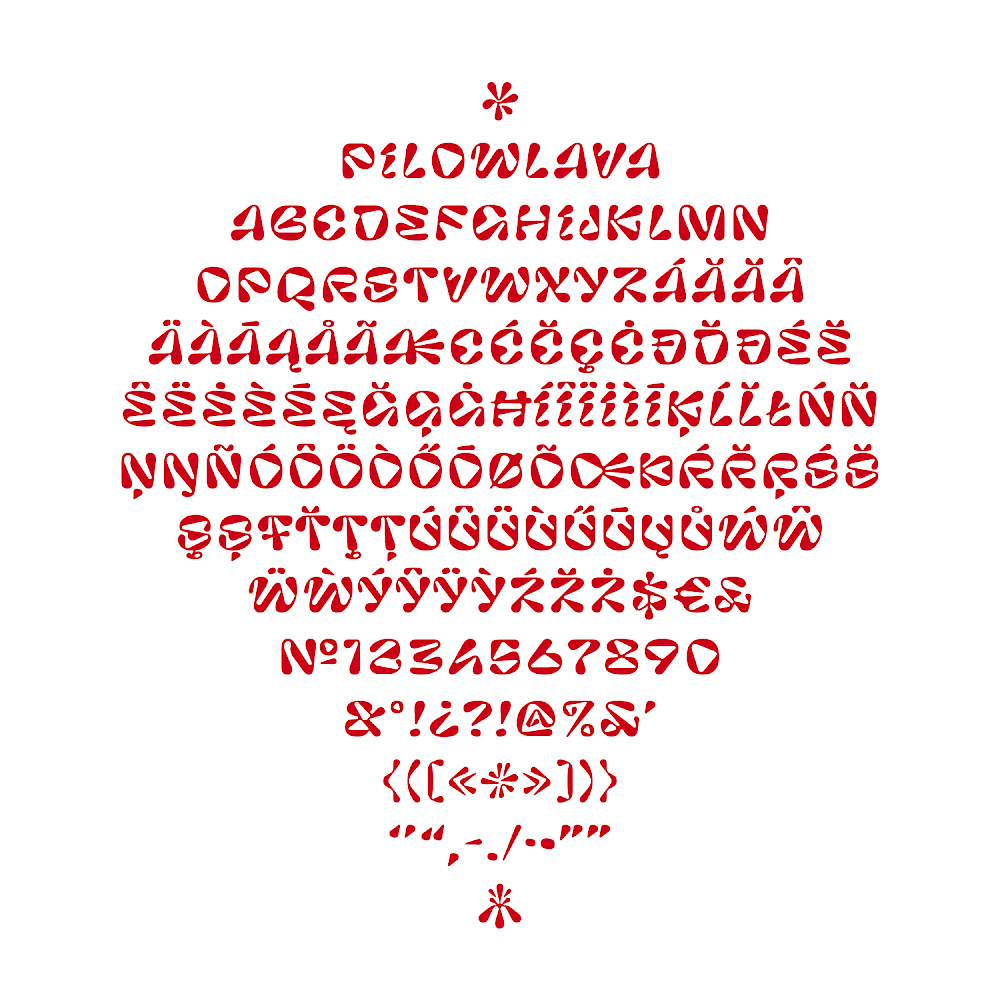
Basic letters and their mirrored or shifted alternates
Pilowlava stays dynamic while being now more contained. The contrast of Pilowlava is always shifting, no singular orientation of repartition of the thicks and thins has been decided. This leads to an always changing text, where you don’t really know where the next explosion will come from. This is even enouraged by a set of alternates, mirrored versions of the basic glyphs, shifting again the dynamic. This could be useful for some logo work where you can pick the version of the glyph your prefer.
Download Pilowlava
