We design libre / open source fonts. Learn more and contribute to the adventure of Velvetyne by reading our “about” page.
New website v3
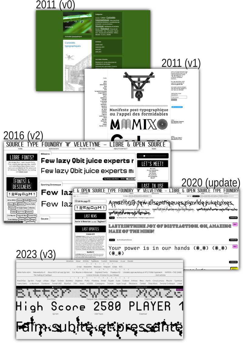
The velvetyne.fr website mirrors the collective’s activities and evolves according to our needs and reflections. Beyond its technical function, it serves as a valuable tool, prompting us to contemplate what Velvetyne Type Foundry represents and the aspirations of the collective.

More than a mere website redesign, the V3 version provides the collective with an opportunity to delve into Velvetyne’s core values. Focusing on our strengths, we aimed to share what we do the best while navigating the economic constraints inherent in a non-profit project, as we work as volunteers. Rather than starting from scratch, we built upon the extensive content gathered from years in V2, including font pages, specimen styles, articles, and In Use images that have contributed to the fonts’ presence in the visual landscape.
In addition to economic constraints, we desired a more restrained visual, technical, and structural approach for the new website. We aimed to add less and remove more, emphasizing simplicity. This article summarizes the technical and contextual aspects of the work undertaken.
Keeping What Works
We retained Processwire, a CMS we use since 2015 for its quality, frequent updates, community support, and compatibility with our shared technical knowledge. The familiarity with its languages (HTML, PHP) contributed to a collective knowledge base. We are very happy to keep on working with this CMS that can grow with us smoothly, and we want to thank every person who helped with issues such as back-end generated SVGs, repeater autofill, form tricks, and other weird custom PHP hooks.

Lighter: Server, Client, and Environment Side
In the initial days of V3, we focused on removing a significant amount of code from V2. All stylesheets were moved to trash, and 90% of the PHP templates were rewritten. Due to the accumulation of updates from various members, patches here and there, the code had become cumbersome, undocumented, and inconsistent. This cleanup presented an opportunity to develop improved code, featuring a better structure, frequent comments, and compatibility with the implicit common “style” shared by Velvetyne members interested in web development.
Removed:
- CSS compiler (Stylus)
- jQuery (finally)
- Most JavaScript functions and libraries
- Images to load on the home page
- Various useless folders on the server
Changed:
- Server host (from OVH to Alwaysdata)
- Announcement system
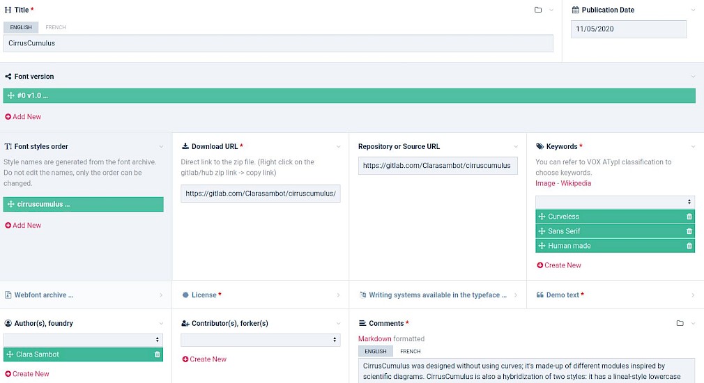
- Font version system, simplified for editors
- The structure of the About pages and sub-pages, which was a bit too complex for visitors
Added:
- 10 lines of basic CSS classes declare for nested layouts (containers, divisions…)
- A New font! (details below)
- The home page now displays static SVGs generated from the fonts each time a font page is updated. This eliminates the need to load each of our font files on the fly, client-side.
- A simple system that displays translated content only when it exists, able to embrace our exceptional bilingual content
- A RSS feed to invite people to follow us with this standard, slow, non-toxic technology
Graphic Choices
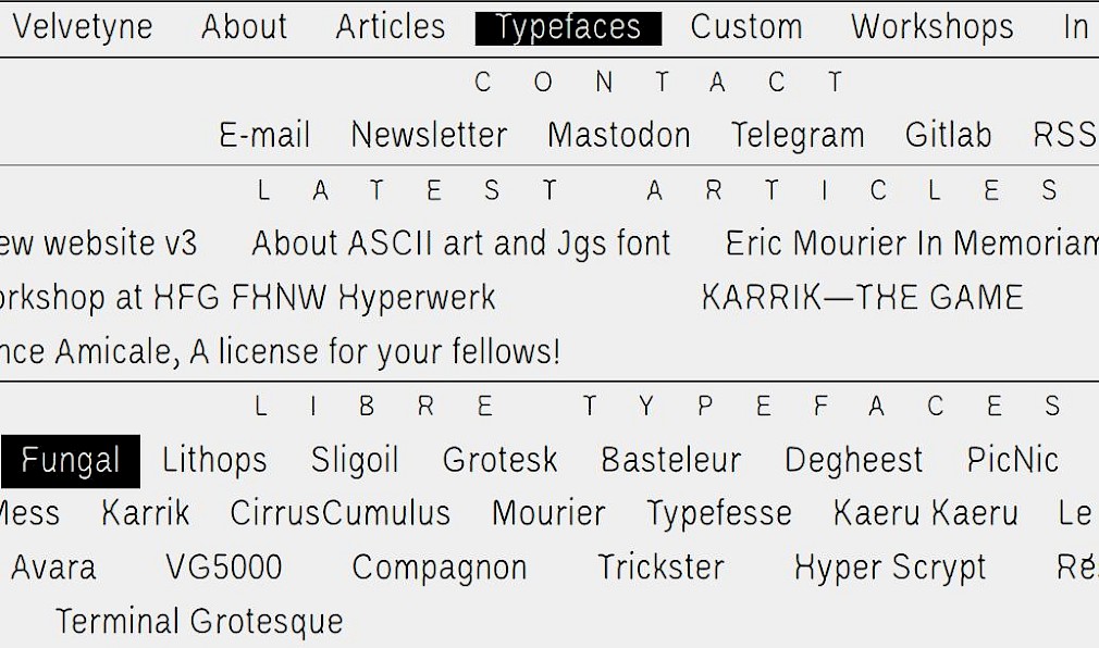
Recognizing the challenges of design decisions within a collective, a single member (I, Raphaël Bastide) undertook both development and design foundations. A minimalist, intentional design approach was adopted, featuring a purposefully present menu, an RSS feed, and layout choices ranging from justified to centered, grid to off-grid, paying homage to early web aesthetics.
I accepted to take on this role, and even though the work was lengthy and occasionally challenging, I still believe it was a good decision to make the website’s release a reality. Making design choices in the name of the collective posed a bit of a challenge for me, but by communicating my progress step by step and informing others about the process, I opened the door to suggestions and comments. This greatly assisted me in embracing this demanding task. The collective provided me with both freedom and confidence to proceed in this direction. Velvetyne, in this context, was akin to any other (kind) client.

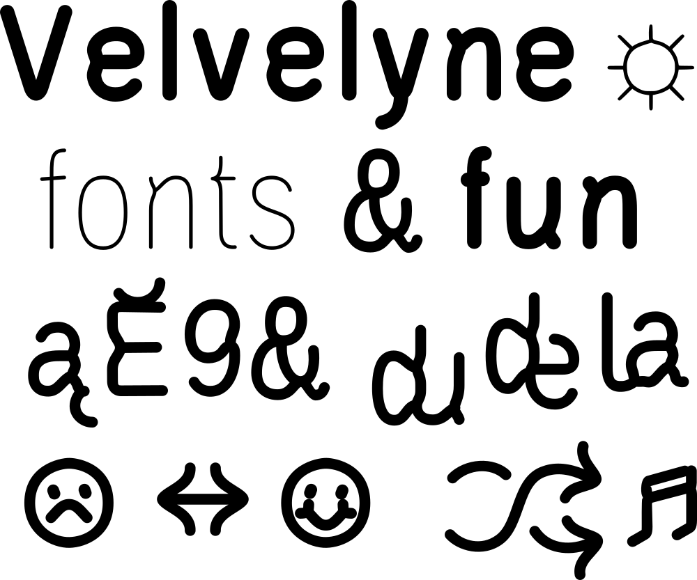
The two Velvetyne members, Mariel Nils and Manon Van der Borght, volunteered to create the font used on the V3 website: Velvelyne. This font emerged from rough iterations of a fork of Liberation Sans Narrow, which were transformed using a font-to-skeleton tool called Skelefont. Allow me a few words on Skelefont: In spring 2023, I approached Benjamin Dumond to develop an open-source Python script to automate something I used to do manually: Skelefont transforms any font into a skeleton, applies a given stroke width, and generates a new font version from it within minutes. The resulting characters are no-contrast, dry-then-weighted version of the original, that is sometimes challenging to even recognize. Skelefont is still in development, we will talk a little bit more about it when Velvelyne will be officially released here.
In the hands of Mariel and Manon, our font Velvelyne evolved from this rugged creature into an elegant, usable character, proudly acknowledging its roots in the structure of Liberation Sans Narrow and the tough diet imposed by the Skelefont program. The first time I tested this font on the web pages, I knew it was one of the most impactful design choices throughout the entire process. Velvelyne brought something that was missing, V3 had a soul.

The outcome of collaboration
Spring-cleaning efforts were made collectively to think and process the retirement of some of our historic typefaces. Additionally, every member of the collective contributed by rectifying texts, translations, documentation, and crafting custom specimens for each font page.
In the end, I come to realize that this website was a collaboration from first drafts to release. This project developed through its dedicated discussion channel over more than… 1 year, (oops) ; Yet, working within constraints is where creativity can truly flourish, and our constraints — economy, time, collaboration — morphed into a distinctive signature for our website, a crucial tool showcasing the world the production of our collaborators, of which we are immensely proud.
I want to thank everyone for their support, special thanks to Mia Riezebos for her help for various dev difficulties. I genuinely hope this new website will lead a vibrant existence, displaying the great content we host, and evolving as it has in the past. The bass line is set; now, let’s kick off the party!